Pages

Friday, 28 February 2014

Z is for

Well folks this is it, the last letter in my alpha tag series. We have reached the terminal and the bus has stopped, so its now safe for you to get off.  I have thoroughly enjoyed writing these posts and hope you have gained something from them. Probably 5 minutes relaxation whilst reading each one, but that's a start.

The final letter is, of course, 'Z' for which I have chosen 'Zenith'.  There are several ways to look at this word - pinnacle, comeback, period of success, glory days. I have certainly made a comeback with my blog; managing to post every day despite the best efforts of the techno gremlins etc. But the inference of Zenith is that you reach the highest point and then what? Is it downhill from then on, do you never raise to those dizzy heights again? 

I don't believe this to be so. Most of the time our lives run along a track which is sometimes bumpy, curves once in a while and then every so often becomes a helter skelter ride. Throughout it all there are various signposts along the way, and these are the ones we take lessons from.

I think, that as creative souls, we experience our own personal glory days, periods when our art just flows - our purple patch. Accept it for what it is and don't mourn it when it is not there, it will return.

My final tag is not my Zenith, this is in fact my 'Xanadu', this is how I imagine the place where I can rest from my weariness and find perspective in my life.
First I took some tissue paper and sprayed it with a selection of Dylusions Spray inks, drying between colours to avoid 'mud'. Just before it was totally dry I scrunched it up to form a crinkled effect and then left it to dry naturally.

I cut out the tag from a piece of grey board (I needed a base that would accept wet mediums without buckling). I then covered this with a thin layer of PVA glue (because I couldn't find my Glue 'n Seal!!) and attached the tissue paper to it, wrinkling it up slightly as I pressed it down. Again it was left to dry. 

Using the Joggles stencil Anicient Ruins I sponged with Turquoise acrylic paint and sprinkled very fine crystal glitter over it whilst still wet. More drying time!

I stamped the castle from the new stamp set Fantasy Castles onto a self adhesive label and coloured with Aquarelle pencils. 

The border at the bottom of the tag is a torn strip from the coloured tissue which I have attached using Ultra High Bond 12mm Tape. Finally I cut out the castle, peeled off the backing paper and stuck it in place, adding the shading around the image with black and grey pencils to give it dimension.

I think we can all say that life is a challenge and we must count ourselves lucky if most of our journey consists of just a few bumpy rides. But if you do find yourself on the helter skelter, hanging in there by your fingernails, remember your glory days and look out for more Zeniths on the horizon so that when they come again you can celebrate and cherish such heady times.

Well that's it, the end of this particular journey. I would like to thank all of you who have accompanied me and supported me with your wonderful comments, it has meant a great deal. Now all I have to do is plan another one...... where next?


PS If any of you are on Pinterest I have created a board to which I have pinned all 26 tags, so if you would like to see them in one place please click here

Thursday, 27 February 2014

Y is for

Well this is the penultimate post in my alpha series and the bus has almost reached its destination, However, don't jump off just yet there are still a couple of letters to go.

We have arrived at 'Y' and I've got not just one, but two words for you - 'Yin and Yang'. This is part of Chinese philosophy in which Yin and Yang represent the two opposite principles in nature, that everything comes in pairs. For example the sun and the moon, male and female, cold and hot - you get the drift; and  that although they are opposites, they rely on eachother.  Basically Yin and Yang are all about balance, if one is stronger, then the other will be weaker.  Possibly the best way to illustrate this is with night and day. During the Winter the nights are longer, the days shorter, in Summer it is the reverse, but there are still only 24 hours in the day - they balance themselves out across this period.

This is how we would all like to live our lives - in balance. David (my OH) and I have a Yin and Yang relationship; most times its 50/50 but sometimes the scales move and then its a case of whoever needs to be stronger in a particular situation will take the lead and then the scales return to the 50/50 mark.

And our art is all about balance - juggling our creativity with everyday lives, understanding the light and shade in our masterpieces. Learning that for every one thing there is an opposite and exploring that opposite when we can.

Today's artwork again started life as an acrylic block background. You really can't beat doing a batch of these.
This one was created with Mustard Seed, Spiced Marmalade and Aged Mahogany Distress inks. I stamped it with a variety of stamps using Archival Deep Purple and Blue Violet.  

The butterfly from Tangled Garden was stamped in Memento Tuxedo Black on a self adhesive label and then coloured with Promarkers. I then covered the whole image with Diamond Stickles and cut it out when completely dry.

I coloured a piece of sisal ribbon with Archival Orange Blossom and attached with PVA glue and added an assortment of flowers in shades of orange and purple, together with pins etc, using a glue gun. I used black pearl stamens for the antennae and glued the butterfly in place (I did not remove the backing from the label on this occasion).


Here is a close up of the butterfly so you can see the colouring a little better. And I have angled it away from the light so that the sparkle from the Stickles doesn't obscure the image.

These colours are almost Yin and Yang, (the opposite colours on the colour wheel would be purple and yellow) but I still think they are in balance.

And that's how it is in our day to day lives, making adjustments where needed so that we can live in balance as closely as possible.

See you tomorrow with the last letter.


Wednesday, 26 February 2014

X is for

When I first talked about writing this alpha tag series two questions were top of the list 'What are you going to do for 'X'? and of course 'Have you any ideas about 'Z'?  Well I'll leave 'Z' for another couple of days but here we go with possibly the hardest letter.

For me 'X' is for 'Xanadu', the definition of which is 'a place of great beauty, luxury, and contentment'. And I am not talking about the movie with Olivia Newtron Bomb! Samuel Taylor Coleridge wrote the poem 'Kubla Khan' in 1797 (published 1812) which begins 

"In Xanadu did Kubla Khan 
           A stately pleasure-dome decree..." :

Although this is a mythical name it is believed that it may refer to Shang-tu, an actual place that existed in South East Mongolia in the 17th century. Whatever the story I like the idea of some beautiful, magical place far away. And isn't this where we all want to go sometimes? Not physically, although that would be wonderful to find such a place, but to venture there in our minds. We all go through periods in our life when, for all sorts of reasons,  it is difficult to live with the reality of our surroundings. And we need some kind of 'safe' haven we can run to. I think that somewhere like Xanadu seems the ideal place; it costs nothing to get there, you don't have to pack a suitcase and you can visit it whenever you want.

There are times when we need this space in our creativity too; when we lose our mojo, when the muse temporarily leaves us, when we are not in a happy place. Just somewhere to rekindle inspiration and relight creative passion. 

Here is my tag for today, another one that I created yesterday.

I started with an acrylic block background using Broken China, Faded Jeans and Evergreen Bough. I then stamped over it with several randomly chosen stamps including the music sheet from Music Fanfare and the Once Upon a Time clear single stamp. I used complementary inks including Adirondak Clover and Versafine Deep Lagoon.

I stamped the Julie Nutting Ruffle Dress onto a single self-adhesive label sheet using Versafine Onyx Black and used Aquarelle pencils to colour the image, blending them with a waterbrush to achieve the shading.

Finally I cut her out, peeled the back off the label and stuck her in place. I do like using self-adhesive labels you can get them in all sorts of sizes and they are a good cheat over masking your images.

So there you have it, I hope you feel I have done justice to the most difficult letter in this alpha series. And although Xanadu may not actually exist if you can envisage somewhere that is beautiful and comforting, where your imagination can fly, then you have found your healing place, your own personal Xanadu.

See you tomorrow


PS Look out for a mixed pack of useful sized labels on the Chocolate Baroque website - coming soon.


Tuesday, 25 February 2014

W is for

I guess this is the last of the easier letters, it's probably downhill from now on??

Today it is 'W' for 'Well'. This word is used in phrases that range from 'Are you keeping well?' through being 'well ahead of the others in the class' to 'Didn't they do well?' From my own point of view I always want to do things well. I don't necessarily mean perfectly, sometimes it is not possible, or practical, to achieve perfection. But if you have done a job well, and to the best of your ability, then that's all that can be expected of you. And we should praise others for doing well, after all it costs nothing to say 'Well done' but those two little words can mean so much.

When it comes to our own creative well what do you do to keep it full and how do you ensure that the ideas keep flowing. We all find inspiration in different ways - from books and magazines, blogs and Facebook groups and Pinterest (how to waste an hour or two creatively!!). Sometimes we need to go to a workshop or have a play day with friends to stimulate the creative juices. 

This tag was made today after having an inky play day of my own.

The background was created with Peeled Paint, Shabby Shutters and Mustard Seed Distress inks using the acrylic block technique.  If you would like to know how to do this technique please read Glenda's Mojo Monday article.

Next a piece of copy paper was sprayed with Lemon Zest, Pure Sunshine and Fresh Lime Dylusions Spray inks. A second piece was sprayed with Lemon Zest, Squeezed Orange and Bubblegum Pink. After semi-drying with a heat gun it was set aside.

Making sure the tag was completely dry a strip down the right hand edge was masked off and then a border was randomly stamped down the side with the Leafy Trails Big Bold Background and a Versafine Onyx Black inkpad.. The length of the tag is longer than the stamp so it was re-inked and stamped again. With the same Distress inks a waterbrush was used to 'paint' over some of the leaves to give a varigated appearance.

The Leafy Trails were stamped on both pieces of the dried copier paper. Then a waterbush was run over some of the leaves and blotted with kitchen roll. This was repeated until some of the colour was 'bleached' out.. Several leafy branches were cut out and set aside. Once the leafy border was dry a soft graphite pencil was used to shade around the leaves to give a dimensional feel.

The cut out leaves were attached by randomly gluing the stems and fixing to the tag. By only adding glue here and there the leaves stand away from the tag. After stamping the word Truth from Artistic Expressions a pencil added shading. It was then finished with co-ordinating ribbon.

I thought I had better show up with some current artwork, just to make sure my own creative well was still working. What are you doing to feed yours?

See you tomorrow

Monday, 24 February 2014

V is for

Hello again, here we are in the last week with just five letters to go. I hope you are managing to stay the course and can finish the journey with me.

Today's letter is V and the word is 'Vision'. The common meaning of the word is the ability to see, and as this is probably one of the most important of the five sense we should all be grateful for this.  But what about those who have the vision to want to change the future; whether by some deed or invention. Leonardo Da Vinci, Charles Darwin, Ghandi and Martin Luther King are amongst those who had the imagination and determination to bring their vision to fruition.Great people with great ideas.

Sometimes we need vision when we are creating, and we also need the willpower to see it through; especially when it is not turning out how we planned. It is easier to throw it away than to work through the challenge, but trying to 'see' past the visual impression is often difficult.

Today's tag is yet another from my box of 'keeps'.

I sponged the tag with Scattered Straw, Spiced Marmalade and Forest Moss to create the background.

I used Potter's Clay Memento to stamp the border from Decadent Brocade. A variety of inks were used on the trees, which are from Woodland Design-a-Tree, whilst the blossoms are from Glade Design-a-Tree.

I die cut the leaves and ran them through an embossing folder before inking with Spiced Marmalade and Forest Moss.

The bottom of the tag was punched to give the elborate edge and the leaves were loosely attached with wet adhesive. I quite like the simplicity of this tag. Must use it.

Okay so the next time you find it difficult to turn your art vision into a finished article think of those who have suffered to bring their vision to the masses; and remember the many people who have turned their visions into reality. If they had thrown their ideas away where would we be. Possibly not reading this blog post for a start!

See you tomorrow

Sunday, 23 February 2014

U is for

So now we are heading down the road of less 'friendly' letters this would be a good time to jump off the bus. However I am going to ask you to hang in there, lash yourself to the seat if you have to but don't abandon the journey.

We are up to the letter 'U' and the word 'Unique'. This is truly simple - we are all our own unique selves. We may have to conform and live within certain parameters according to the law etc but that doesn't take away from us all being special. How we build upon our uniqueness is another matter, we can only hope that we grab the opportunites as they arise and that we don't squander them.

Remember when you are creating your masterpieces that you add something uniquely you to every project you make. We all have a certain 'style' that stamps itself as being our artwork; even if we emulate others we still bring that certain something of our own to the party. 

To my party today I am bringing you a tag that I made quite a long time ago. It has been languishing in my 'keep' box. I think it's about time it received an airing.


I wanted a different shape to my tag so I decided upon this double ended version. The tag was covered with one of the printed papers from the Butterfly Bliss Cd-rom (no longer available I'm afraid). I then brayered a piece of silk art card with Scattered Straw Distress ink, masked off both sides and brayered Dried Marigold down the centre. 

The matching corners are from Nature Swirls and were stamped with Butterscotch Adirondak dye ink; whilst the sentiment from Words of Comfort and Cheer was stamped with Espresso Adirondak. Finally I used a gold fineliner pen to add the squiggly lines!

We are all given chances in this world, some greater than others.  Recognising what they are, and how to deal with them, is all part of our unique self. It may be great to be part of a crowd, and we all want to fit in at certain times in our lives. But there is no such thing as a perfect fit, just the ability to recognise those people that understand our own particular brand of uniqueness. Keep it polished and be proud of it.

See you tomorrow.


T is for

This post may appear a little later than usual, not because of the techno gremlins but I have been having a play day with friends and became somewhat distracted.

Today it is time for the letter 'T' which stands for 'Try'. This word was a suggestion made to me very recently and I have actually substituted the word I was going to use. 

What does the word 'Try' mean to you apart from being something to do with scoring in rugby? There is nothing wrong if you try to do something but don't succeed. It's very easy to say 'I can't do this' or 'I don't like' that without ever trying. It often takes a lot more effort, guts and determination to try; even more so if you get knocked back. There are many people to be admired for continuing to try, to keep coming back for more. However, there is something that can be counter productive; here's an example.

How many of you got 'must try harder' on their school report? And actually, how demotivating was that comment? As crafters one of the things we are all guilty of at some time or another is trying too hard. We have surrounded ourselves with crafty stash, sat down at the table and then everything we stamp, colour, ink, cut out fails to strike the right note. We aren't happy with any of our creations and our confidence takes a knock. I know, I've been there. And it's okay, you don't have to produce a stunning piece of artwork every time you sit down with a stamp or colouring pencil in your hand. The more you force yourself the less creative you will be.
My tag today is one that I made some time ago.

The leaves from Woodland Dreams were stamped using a selection of dye based inks. I then stamped several more onto another piece of card, cut them out, dusted Perfect Pearls over the top and attached them to the tag using foam pads.

The sentiment, also from Woodlands Dreams, was then stamped, cut out, edged with ink and finally attached with more foam pads.

This tag was very simple to make, but quite effective don't you think.

I'll finish with this, the next time you find yourself not achieving the goals you set for yourself don't stop trying, just stop trying too much.

See you tomorrow


PS Thanks to my best buddy Glenda for today's word

Friday, 21 February 2014

S is for

Hello all thanks for joining me once again to participate in the alpa tag series. I'm going to whisper the next bit so if you'd like to get a little closer to your computer......gemlins permitting I'm going to try and get this posted this evening.

Okay you can sit back comfortably again, while I press on with the letter 'S'. There are lots of possibilities but I have settled for 'Shade'. We all need light and shade in our lives otherwise things would be very monotonous and one dimensional. Many people would probably refer to the happy times as the light and therefore the shade as the unhappy ones. But I don't believe this to always be the case. Shade can actually come from a time in our lives when we retire for some quiet reflection, where we ponder certain questions and possibilities before we continue with the future. To me Shade is more of a calming influence, a more down to earth approach to life; whilst light can be more frothy and less restrictive.

Understanding shade, and therefore light, is an important part of our artwork. When colouring an image we need to decide which direction the light source is coming from so that we can add shading to give a realistic, three dimensional effect. We also need to appreciate shades of colours so that we can create a pleasing composition.

Here is my artwork for today
This is another tag that I created a couple of years ago.

The background was sponged onto the tag using Scattered Straw and Dusty Concord Distress inkpads.

The main image, swirls and phrase are from the Patchwork Butterfly stamp set and were stamped with Aged Mahogany Distress and Paris Dusk Memento inkpads.

The wording was stamped onto a piece of background paper printed from the Essence of Nature CD, the edges were randomly torn and then it was attached to the tag. Finally I used a glue pen and some gold foil to 'flitter' around the butterfly and wording.

Unfortunately the camera (and therefore the operator of said instrument) doesn't capture the gold foiling very well but this is a great way to add highlights to your artwork.

One last thing, when colouring I often use shades of grey to add more dimension to the image...I shall leave you to make up your own ending!

See you tomorrow


R is for

I don't exactly know when you will read this post, but safe to say it is probably not going to make it for actually being posted on 20th February 2014. I have to say that the techno gremlins are trying their hardest to knock me off target, tonight was a lack of internet; in fact a lack of anything that could commuincate with the outside world. At this point it would be so easy to give up rather than battle on but guess what...?

Today's letter is 'R' and I could have gone for 'Random' because that is how my computer works - 'at random', or how about 'Refuse' as in technology refuses to co-operate with anything. But I had already decided on today's word which is 'Reward'.

To me a reward is something you have earned and it doesn't have to be huge. It could be an extra biscuit with your tea because you told yourself that's what you would have if you completed a project within a certain time limit. It's almost like goal setting, with a treat at the end when you reach the target. Whatever the treat, and however it is earned, the reward should be given for some sort of positive achievement. It's an upbeat thing. What it should not be is something which is given irrespective of whether it is deserved or not. Bonuses for poor performance, payoffs for doing the job badly, paying kids to go to school (huh??). Why should we honor negative outcomes?

I think we all deserve to reward ourselves for our artistic achievements, however large or small. Being kind to ourselves does not always come easy, as I have said before we are our harshest critics.

My artwork today is another hybrid tag.
 I suppose this is almost instant crafting. Take a tag with a pre-printed background, add another design on top of that and finish with dimensional embellishments. 

Ok, so I created a new design over the Vintage Tag background, but you could equally stamp on this and then colour in the image or you could stamp onto a self adhesive label, colour, cut out and stick on.

I actually like this form of crafting, its not cheating its embroidering on what you already have to produce a new piece of art; and if you sometimes struggle with creating the background using something that already has a design on it sets the creative juices going. Try stamping onto old dictionary or book pages, patterned paper or even brown wrapping paper.

If we want rewards in this world, whether it is applause for our art, a comment on a blog post or that extra biscuit with our tea, we really need to work for them so that when they do come there is a real feeling of achievement. After all, anything that leaves us feeling positive and upbeat is a reward in itself. 

See you tomorrow, or should that be later today?

Wednesday, 19 February 2014

Q is for

So, today I hit the first of the 'hard' letters - Q. But for me there is no difficulty (not sure I feel the same way about about X and Z!), as I have decided that 'Q' is for 'Question'.

When it comes to answering questions those of us with children should be experts on 'Why'.  This appears to be the first big question that they latch on to from about the age of two plus. And boy is it a test of our answering power. Hands up those of you who have resorted to the immortal words 'because it just is' after your mini mastermind has asked you 'Why' for the tenth time in a row? But no matter what you say your kids trust you to tell them the truth.

Move the questioning on a few decades and we come up against the politicians and other public figures who have adopted this same form of avoiding answering. Seems the more sensible the question the more they dance around giving a straight answer. And isn't it funny how truth evaporates with age.

I am continually asking myself questions when creating with stamps, inks, paints etc. And the only way to get answers is to experiment, try out the question, research, play; and when it goes wrong try again.

Today's tags are part of a bright and quirky set I made well over a year ago.

They all include papers from my printable sets - Polka Dotty and Polka Dotty Distressed. All the stamps are from the Happy Words and Birds and Party Words and Birds clear sets. 

I added a few gems and washi tape to finish.

I'll leave you with one last point, when I run a workshop I always tell everyone to keep asking questions and I often get the reply 'I feel silly asking questions all the time'. I only have on thing to say to that 'the only silly question is the one that goes unasked'.

See you tomorrow


Tuesday, 18 February 2014

P is for

Hello, here we are day fifteen and the bus is rattling along at a rare old pace. I guess people are jumping on and off when they feel like it, I hope you are enjoying the ride.

I am finding it increasingly difficult to make the introduction of each letter interesting - I almost feel like I should be saying 'tonight Matthew I'm going to be.....!' So small drum roll please and a round of applause for 'P' which today is for 'Push'.

This is another letter where I find some phrases amusing. 'Push bike' kind of defeats the object of the exercise, 'Pushing the envelope', how heavy are the envelopes in your office? 'To be given the push', fine if you are on a swing, not good if it refers to your job. When you look at the different meanings for certain words, or how the meaning changes according to the phrase in which it is used, it's no wonder that anyone trying to learn English is confused.

During World War 1 the generals of the English army decided there was to be a 'big push', which they anticipated would weaken the German defences and bring the war to an end. Subsequently there have been many projects entitled the big push, so designed in an attempt to unite a particular section of people and galvanise them into action. Sadly, like the WW1 effort, many of these have failed.

So where does 'push' come into our art. Well there are many artists who have pushed the boundries and made us view and rethink our conception of art. We all 'push' ourselves on a regular basis; whether to master a new technique or to just keep going against the dificulties we face. Maybe we don't push ourselves enough?

Today's artwork is another from the archives, which I am enjoying revisiting

The tag is one of my Vintage Tag printables on which I stamped the birdcage, flowers and phrase from Pretty Birdcage.

The flowers were coloured using Coloursoft pencils and I used a glue pen and some glitter to highlight the flower centres.

Although this photograph doesn't really show it too well, the birdcage has been foiled to give the bars their metallic appearance.

A paper rose and ribbon bow just add the finishing touches.

I think there is something very poignant about the empty cage and the phrase 'My soul is in the sky..' emphasises this all the more.

Revisiting this tag has made me realise that sometimes we just have to push through - that could be through barriers, through bad times and even through our own emotions. Pushing through makes us stronger.

See you tomorrow


Monday, 17 February 2014

O is for

Now I am starting week three of my daily posts and apart from a little hiccup over the weekend, I am managing to keep up. The wheels on the bus are going round faster and I'm driving with only one hand on the wheel!

I appreciate that this side of the alphabet is littered with difficult letters but I am not going to let that be an excuse. So while we are still on the easy ones 'O' is for 'Open'. You can ask an open ended question, have open house or work in an open plan office. How about an open mike night, or why not go to the school's open day and letting the kids play in the open air is really good for them. For me the word open signifies honest. From a young age I was told you had to be open with people as in 'open and above board' and now in my adulthood I understand the meaning behind my grandmother's words.

If you are open and honest with people they learn to trust you and you earn respect. Given that our society seems to breed alot of mistrust from the Government (expense scandals etc) downover perhaps adopting an open policy would be no bad thing.

Open is an important word in our art too. We need to be open to new ideas and open up to creating our own opportunities and possibilities.

Today's artwork is a tag I made quite some time ago, once again from my dual handed period!

This tag was originally posted on the Chocolate Baroque Design Team blog and it is amongst some of my most favourite pieces of artwork. I hope you enjoy revisiting it too.

The Sunny Sunflowers and leaves were all stamped onto self-adhesive labels, coloured with Promarkers and then cut out. Instant stickers!

The tag itself has been covered with dictionary paper and then  lightly painted with white acrylic paint and inked with a Tumbled Glass Distress ink pad. Finally I added a selection of paper flowers, pins and gems.

One of the DT members was at my workshop last Saturday and she complimented me on a project that had been published in Craft Stamper adding 'you should do more blue flowers'. And d'you know what? I agree; after all colouring flowers blue is being open minded... right?

See you tomorrow


Sunday, 16 February 2014

N is for

Okay so this is two posts in one day, but at least I am back on schedule.

Onto the letter 'N' which for me is 'Need'. This is another one of those words where the defition changes according to whether it is a verb, noun or adjective. Sorry, didn't mean to turn this into an English grammar lesson. However, our basic understanding of the word is 'if you need something is it because it is necessary'. But, once again there are some strange phrases associated with the word; 'Need you ask?' - of course I do or why would I be asking, 'In this department we work on a need to know basis', how do you know what you need to know? and telling someone they need their head examining is maybe not the smartest thing you can say.

And in the craft world we all know the meaning of the word 'Need' don't we???? If you haven't realised there are three stages to craft purchases - liking, wanting and needing. You know you're hooked when you start skipping straight to stage three!

Here's another hybrid tag
 This one is also based on one of the Vintage Tag printables with new design elements and the addition of ribbon, pins. flowers and gems.

This tag would probably fall into the quick and easy section of crafting. Download the tag, print it and add your own finishing touches. And sometimes that it exactly what we need to do. Make some quick and simple.

One final thing I would like you to think about. There are certain times in our life when we must recognise when we need something. Whether that be help in our job, advice on a particular problem or comfort from a partner or friend. And once we recognise that need we must never be afraid to ask for it.

See you tomorrow


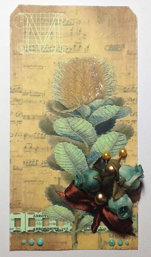
Here is my second attempt at M is for

Hi there I'm back on the trail again, sorry I didn't make the post yesterday. The workshoip went really well but I was quite tired last night and didn't want to post the next in the series just to get it posted if you know what I mean.

So here we are in the middle of the alphabet although that is not today's word; 'M' is going to be for 'Moment'. They say that there are certain world events where we can recall exactly where we were at that moment - the day Princess Diana died, 9/11, the day the Berlin Wall came down. And even though I was a young child I can remember the night we heard the news of the assassination of John F Kennedy. What is it about these moments that they become fixed so clearly in our brain? Especially since many of us can't remember what we had for dinner yesterday.

Of course all the events I have mentioned were unusual and deeply significant, whereas your dinner was not headline material. Most of our lives aren't headline material, but there are moments that we need to capture so they become even more precious memories.

Art is one of the best ways to record such moments. Painting, drawing, photography, scrapbooking, journaling, mixed media etc are all aids we can use to fix our own moments in history. Reliving the memory whilst we are capturing it by whatever means we have chosen can also be very cathartic.

Here is some of my artwork
This tag is a hybrid - a combination of one of my Vintage Tag printables  with some new design elements added and finished off with physical embellishments.

Designing new printable downloads has been difficult during the last year, but I have managed a few - they have just taken me a lot longer. I am sharing a couple of these with you - the first time they have been seen publicly.


In a conclusion to what I said earlier about remembering where we were etc I think the main key is what we were feeling at the time. For me emotions are a powerful tool, so if you can harness your feelings within your art your memories will be with you as fresh as the day they happened. And don't forget even recalling sad memories is important, after all they are as much a part of us as the happy stuff.

See you tomorrow.


Saturday, 15 February 2014

M is for

Roll on the drums, I have made it to the half way poitn. Hurrrah we are moving on apace now.

Sadly I'm not feeling too good and my arm is particularly play up - so if you don't mind I'll do a double pos tomorrow... see you then


Friday, 14 February 2014

L is for

Well hello again, here we are at another letter. This post may be a little shorter than usual as I'm teaching a workshop tomorrow and it takes me a while to put everything together that we'll use in class.

Okay, so today the letter 'L' is for 'Laugh' and I think we need to do this at least once every day. It is a proven factor that it help ease stress, sooths tension, it can help lessen depression but most importantly it lightens your mental load. Now even if this is only for a short time it has to be good for you. Humour has been know to defuse difficult situations and whilst it may not be the best defence against guns and weapons, I would much rather that those in power spent some of their spare time watching comedy programs than playing shoot'em up aracde games if you get my drift.

Workshops are a great place for having a good laugh, I certainly know that the girls that attend mine enjoy the spark of humour just as much as the crafting. Plus we need to be able to laugh at ourselves, and with others, and doing it amongst friends is somehow comforting.

Today's artwork is a selection of tags I made some time ago, when I had both hands on the stamps!


First I randomly sponged a piece of A4 160gsm cardstock with Mustard Seed, Spiced Marmalade and Barn Door Distress ink. Its much easier colouring a largre piece of paper/cardstock, you invariably have some left over for another time and you can make several backgrounds in one sitting.

I stamped one of the mannequins from the Haberdashery set three times on dry coloured background and then used a selection of stamps from Mini Scripts, Mail Art and Curiosities over the bodice of the mannequin. Each one was then cut out and mounted on a tag using foam pads and finally I stamped the cotton reels and the phrase (again from the Haberdashery set) on the third tag and finished off with orange satin ribbon. By the way all the tags are from Set 4 of my Chic Script printable download collection.

One last thing; we all know life is a serious business, there's no getting away from that, but learning to laugh in the face of adversity definitely helps you get through.

Right that's it for this evening I'm off to prep my workshop, see you tomorrow.


Thursday, 13 February 2014

K is for

Hello there and welcome back for another day in my alpha blog series. I think the bus is jogging along quite nicely now and I'm rather enjoying the view.

Today 'K is for 'Keep' and no I'm not talking about the tower attached to a castle! One of the main dictionary definitions of the word keep is 'to stay in a state, position or place without changing or moving'; and in some circumstances this would be ideal. To keep still whilst having your photograph taken is very practical, it would be understandable to keep quiet because you were afraid and to be warned to keep out of a dangerous area is definitely sensible.

But how do you feel about keeping someone down or keeping them under control? Isn't it amazing how one little word can have so many meanings, both positive and negative. 

As crafters we all know about the word keep. 'I must keep that 2" piece of blue card in case I need it sometime!' or 'I have to keep that new pad of patterned paper, it's too good/nice/pretty to use!'  The reality is you wouldn't keep a 2" piece of kitchen foil in case it might be useful, and you wouldn't buy a new dress and not wear it because it was too pretty. Strange how if you put things under the umbrella of 'craft' they completely change their meaning!

Now for today's tag. If you follow either Glenda or myself on Facebook then you may have seen this tag before. But I have to say that day in late October last year was a ray of sunshine for me and one that helped me keep my chin up; so I'm sure you won't mind be posting it here.

First I stamped the Julie Nutting Peasant Dress with Memento Tuxedo Black. I then stamped her again on Masking Tissue, cut her out with the help of a pair of friendly hands and then laid the mask over the image on the tag. The background was created with a combination of Dylusions Spray inks in Pure Sunshine, Lemon Zest and Squeezed Orange. (I also sprayed the same combo of colours onto a spare piece of 160gsm white card and left that to one side for later). 

After drying the tag with a heat tool I sprayed Postbox Red through the 6" Crafters Workshop Template Art Is and then sponged through the12" Flower Frenzy stencil using Golden Fluid Acrylic Paint in Cobalt Turquoise. And finally I sprayed White Linen spray ink through a circle stencil.

The Peasant dress was stamped onto the spare coloured piece of card, the dress and the hairband were cut out and attached to the tag with a wet adhesive. When completely dry the hair, face, legs, arms and shoes were coloured with Copics and the word 'delight' added.

One of the phrases I do like is 'keep going', not always easy to do but when faced with some kind of adversity, or what appears to be a brickwall I urge you to try it. It may seem like the hardest thing in the world but sometimes keeping going is what keeps us going.

See you tomorrow


Wednesday, 12 February 2014

J is for

Hello to all my new followers, thanks for joining me on this alpha journey; I hope you enjoy the ride.

Well I am up to day ten, which I have to say is a new record for me. At times it is a little bit of an uphill slog and I'll take this opportunity to apologise for my camera skills (or lack of them). It proves quite a challenge trying to photograph my artwork semi single handedly. But I have to say all your lovely comments are really helping me to carry on.

Now then, the letter 'J'. I have chose the word 'Justice', an important word in our modern day world I think. I am a great believer in fair play and to me justice means the same thing. One of the dictionary definitions is 'treatment of people that is fair and morally right'. Treat people as you would wish to be treated is not a bad moral code for oneself. And we must trust in the judicial system, that 'right' will out. Unfortunately I think this sometimes depends where in the world the system resides, and by whom it is run.

Many times when we are creating our latest masterpiece we don't do ourselves justice. We are our own harshest critic and when a project doesn't turn out how we imagined it we tell ourselves we have failed. That's the committee in our heads again. Apart from you, no-one else had a clue what you were trying to create but in your mind you don't think you've tried hard enough. Learn to cut yourself a little slack (and if all else fails take the chairs out of the committee room!).

Today's artwork is another design I taught in a workshop last year.

The crackle background was created by colouring a piece of A4 cardstock with a combination of Mustard Seed and Vintage Photo Distress inkpads. Then painting it with PVA glue and adding a top coat of cheap cream matte emulsion paint. This was then left to dry overnight before I cut out a tag shape. Top Tip: Invest in some of those tester pot paints you can buy from all DIY stores. There are some fab colours around, but if you want to tint them yourself I suggest you get very pale ones.

Next I added a piece of torn dictionary paper using Glue n' Seal. When dry I sponged a little Vintage Photo around the edges and stamp the trailing leaves from the Wisteria Lane stamp set using Vintage Sepia

I coloured the blank mannequin with Mustard Seed and Spiced Marmalade and stamped it with an image from the Fancy Flowers stamp set. I punched a border from cream cardstock, cut it in two and layered it on the bottom of the tag. I spritzed the mannequin and a scrap of dictionary paper with gold mica spray, then punched out the butterflies. Finally I attached the mannequin with foam pads and glued the butterflies and paper daisy in position.

I have to tell you that if you had seen me creating the crackle background with just my left hand you would have thought I had lost the plot. It took me nearly an hour and that's without drying time! But justice was served because it came out really well. 

Finally, the next time hear someone say there is no justice in the world, what they really mean is 'it's not fair'. And maybe in that instance they might be right.

See you again tomorrow


Tuesday, 11 February 2014

I is for

Hi everyone, hope you managed to catch up with my H tag yesterday - the gremlins got loose again and the post disappeared during the night. Think I've manage to corral them for the moment.

Okay so let's move on to 'I'. There are many I words that have some significance to me - inspiration, imagination, idea, individual, imperfect, improve and even irritable.  But I have chosen Intention.  How does the saying go 'the road to Hell is paved with good intentions'.

I am sure we set off with good intentions - this year we are going to lose weight, take more exercise, de-clutter etc etc. But then we get hijacked by life. Bad weather, can't exercise as much and no-one wants to start a diet when it's cold and msierable. Really busy at work, too tired to keep awake to watch the telly, never mind sort out that pile in the corner!  The intention was to get a better life for our country - we didn't mean to start a civil war. You see what I mean?

We get out our inks and stamps and paints and bling and it's our intention to create a brilliant piece of art. And then something gets in the way of our intentions. The biggest intruder is our own mindset - it's not good enough or it's just not turned out how we had imagined it, the colours are wrong, this was not our intention. Been there, done that!

I made today's tag on the same day as 'C', so this was another three colour tag challenge set by Glenda.


This time I created the background with Distress Stain in Picked Raspberry, Spun Sugar and Tattered Rose. Once dry I brushed a little of the same colours over the top using Distress inkpads

The stamp is from one of my all time favourite sets, Harlequin Rose, and this was coloured with Coloursoft Pencils.

Finally I added a few highlights with a white pencil and finished off with matching satin ribbon.

Although this is a one dimensional tag I love the effect of the collaged stamp image - there is so much depth.  Here is a close up of that stunning rose


Now I don't wear rose tinted glasses and am fully aware that there are whole bunch of people in the world who have nothing but bad intentions. But I also believe it's not always someone's deliberate intention to cause harm, trouble, unhappiness or distress. Intervention by some other force is where we get derailed. And the worst one is where we derail ourselves. 

I read a great blog by Jennifer Boykin who talks about the committee in your head and it is that committee who pull up their chairs and shout out things like 'rubbish' and ' throw it in the bin' that really knock our good intentions. Next time they try to have a meeting whilst you are creating just ignore them,  after all there is another saying 'empty vessels make the most noise'.

It is my intention to see you tomorrow.


H is for

So here I am starting week 2 and post number eight in the alpha blog series. I hope you are enjoying the posts as much as I am enjoying writing them and that somewhere amongst these words something resonates with you.

H for Heart may seem an obvious choice, but once again I find myself amused by some of the phrases associated with it. How many times has someone said to you 'oh he/she had a change of heart' - think about that for a while. What about 'black hearted' - wrong colour scheme, 'her heart's in the right place' - one would hope so; and finally how about 'wearing your heart on your sleeve' - extremely messy!

Okay, so what is actually being said here is that apart from your heart being the key organ that keeps you alive, it is also an emotion, a feeling, an experience. The word heart is a noun, but it can also be an adjective; it is an organ in the body and we all have one (unless you the Doctor and then you have two!), it is a shape associated with love and it is a suit of cards. And this noun is one of the most commonly used in well known phrases and sayings, not to mention in song titles.

So whilst I know everyone physically has a heart what does it truly mean to have heart; and I can only speak for myself  because this can only be subjective. My definition is that to have heart is to be courageous, it is about being able to love and be loved, it is caring about and for others, it is having a sense of understanding and being respectful of the feelings of others. It's knowing when to be a friend, even to a stranger. 

Today's tag must seem a little obvious, but this is a piece of artwork I made just two or three months ago and I love the zingy, vibrancy of it.
 I started by covering the left hand side of the tag with lime acrylic paint using an old plastic bank card. Don't throw away your old cards as this is a great way to swoosh paints and inks onto your projects. After heat drying I covered it up whilst I sprayed the other side with Squeezed Orange and Bubblegum Pink Dylusions Spray Inks. Once completely dry I stencilled the circles with white acrylic paint and added more interest with black using Cell Theory.

I stamped the Cherish Heart twice, once directly onto the tag and then onto some smooth white cardstock. This one was coloured with Copics and cut out. To complete I used stamps from Wild Meadow and Artistic Expressions, ran a Tuxedo Black around the edge of the tag and attached the heart with strong adhesive, making sure to match up the trailing leaves with the image already stamped.

Finally I used grey Copics to add a shadow around the heart to give a three dimensional apprearance (the tag is actually flat to the tag). Here is a close up of the colouring and shading. The cutting out is a little shaky, but hey ho I still like it.


Whilst writing this blog I have come to realise one thing for certain there is a direct link between how you are feeling in your heart and what comes out in your art; one is almost definately a reflection of the other.

That's it for today, I will see you tomorrow. Oh and if you want to while away a few minutes why not see how many phrases or song titles you can come up with that have the word heart in them.